What Message is the Beveridge Curve Sending?
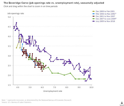
"The Beveridge Curve ... plots the job openings rate with respect to the unemployment rate. During an expansion, the job openings rate is high and the unemployment rate is low moving to points along the curve up and to the left. During a contraction, the job openings rate is low and the unemployment rate is high moving to points along the curve down and to the right. A shift in the Beveridge curve can indicate a structural shift in the economy due to industry-based structural mismatch and geography-based structural mismatch. For example, if the job openings rate and the unemployment rate are both high, this could shift the entire curve up and to the right."These various patterns are apparent if you look at a recent Beveridge curve, which is published each month as part of the press release for the most recent Job Openings and Labor Turnover Survey statistics. This is the figure published in early January, which includes monthly data from December 2000 up through November 2018.
The key point here is that the Beveridge curve seems to have shifted since the start of the economic upswing back in 2009. Starting in 2000, through the recession of 2001, the upswing from 2001 to 2007, and the start of the Great Recession, the data on job openings and unemployment basically moves back and forth along the same line. As the Great Recession deepened, the Beveridge curve stretched out to the far lower right. But then when the economic recovery started in 2009, the Beveridge curve relationship did not retrace the earlier pattern from 2000-2009; instead, it moved out to the right, as shown by the purple line in the figure.
What does this shift in the Beveridge curve relationship mean? In a literal sense, it means that for a certain unemployment rate (on the horizontal axis), there is a higher rate of job openings (on the vertical axis). To put it another way, employers in the years after 2009 seemed more reluctant to fill their job openings, or as economists say, it appeared to be harder for employers to find a match when they listed a job among the workers who were applying for those jobs. The "matching efficiency" of the US labor market had declined.
Shifts in the matching efficiency of the labor market are not a new thing. Here's a figure from an article in the Journal of Economic Perspectives a few years ago, showing the Beveridge curve relationship from 1950 to 2011. The curve seems to have shifted out from the 1950s to the 1960s and 1970s, but then shifted back in the 1990s,

Jessie Romero provides a short overview of the recent evidence about skill-based and geographic mismatch in "Help Wanted: Employers are having a hard time hiring. Not enough workers or not the right skills?" in Econ Focus (Federal Reserve Bank of Richmond, Third Quarter 2018, pp. 8-10). Romero cites various studies to the effect that in the Great Recession and its aftermath, mismatch of labor demand and supply across industries, places, and skill levels may have pushed up the unemployment rate by as much as one-third. These studies also suggest that while this higher level of mismatch often follows a recession, it usually lasts about three years. However, the Great Recession was so severe that the period of mismatch was extended.
As shown in the first figure above, the most recent Beveridge curve data has now looped all the way back around so that the combination of the job openings rate and the unemployment rate--and the extent of labor market mismatch--is similar to the US economic experience back around 2000. While this is generally good news, Romero ends on a cautionary note:
"In addition, although the Beveridge curve has largely looped back to its pre-recession position, it still remains further to the right than it was for much of the postwar era. According to research by Thomas Lubik of the Richmond Fed and Luca Benati of the University of Bern (Switzerland), with each successive recession since the 1950s, matching efficiency has gone down � the unemployment rate implied by a given job vacancy rate has increased. A likely explanation for these successive rightward movements is technological change whose effects on the labor market are hastened by recessions. A large body of research has documented how such change has tended to benefit workers with more skills and more education. These forces might be masked by a hot economy for a time, but if things cool off, some workers, especially the more recent entrants to employment, might once again find themselves without a match."In a post back in 2012 on the Beveridge curve, as it started to shift out to the right and loop upward, I finished with this thought:
[The] Beveridge curve is apparently one more manifestation of an old pattern in academic work: Curves and laws and rules are often named after people who did not actually discover them. This is sometimes called Stigler's law: "No scientific discovery is named after its original discoverer." Of course, Steve Stigler was quick to point out in his 1980 article that he didn't discover his own law, either!
But William Beveridge is a worthy namesake, in the sense that he did write a lot about job openings and unemployment. For example, here's a representative comment from his 1944 report, Full Employment in a Free Society:
"Full employment does not mean literally no unemployment; that is to say, it does not mean that every man and woman in the country who is fit and free for work is employed productively every day of his or her working life ... Full employment means that unemployment is reduced to short intervals of standing by, with the certainty that very soon one will be wanted in one's old job again or will be wanted in a new job that is within one's powers.�


No comments